


Day 4 | Branding |
 On the surface, the name Delta Tule refers to the California Delta. Tules are reeds that grow abundantly throughout marshy areas along the river. I use kraft paper soap labels with a reed-type symbol that I drew to symbolize a tie to natural elements.
Growing up, I spent every summer vacation on the delta with my family. There's no way I could sum up the impact of those memories in one package. Instead, I've based this brand on the appreciation and connection with nature I found there enjoying so many summer camping trips. Now that we live much closer, it's easier to visit. Pictured left is our dog, Bella, enjoying a gorgeous summer afternoon in her natural habitat last year.
My concept of the Delta Tule brand is a promise of natural, meaningful skincare products that add goodness to your everyday life. That means unique items made with thought, consideration, and quality ingredients, and products that don't just leave your skin feeling good but are also eco-conscious and helping reduce plastic waste.
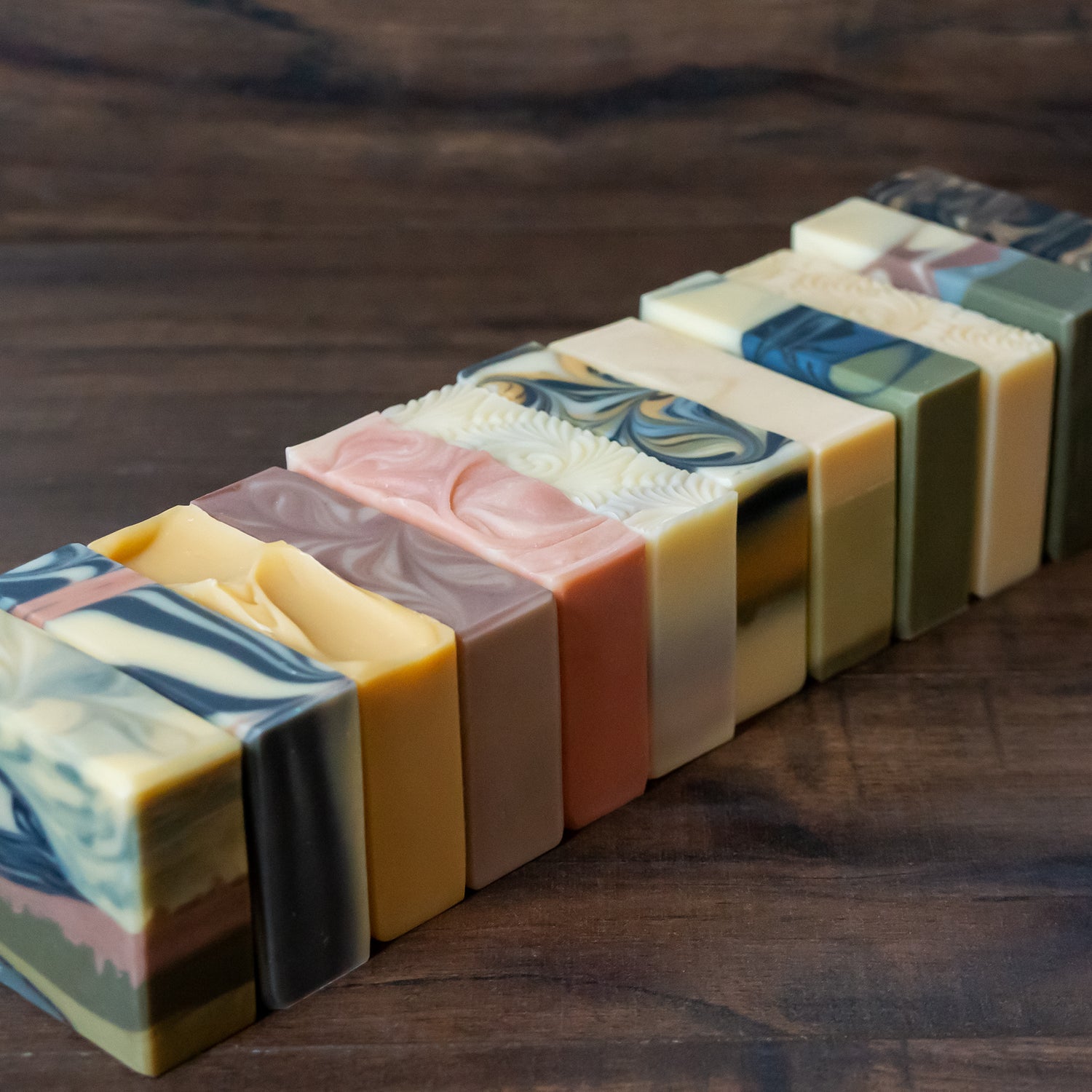
I try to name products with a river-theme or after local landmarks if I can. I don't necessarily think I have a final logo yet, but I do try to keep the look of everything tied together with a font I just happened to love because of its stylistic alternatives (p.s. I'm a graphic design font nerd). I like to minimize using too many different fonts to keep products looking linked through packaging and natural colors.
Last, branding to me also includes a commitment to your customer, which would be to strive to make each customer feel like they're my only customer.